
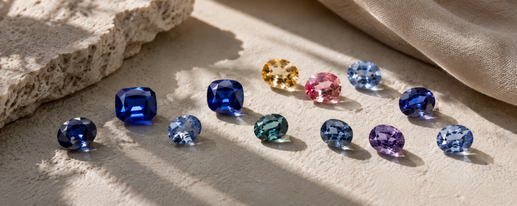
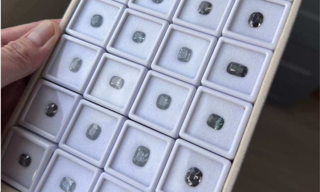
Grey spinel can look simple at first glance, but the category becomes much more varied once several stones are placed side by side. One may read as cool silver, another as bluish grey, another as violet-grey, and a darker stone may feel closer to charcoal.
These differences are not best understood as a scale from better to worse. They come from the relationship between tone, the subtle colour that sits within the grey, and the way the cut and lighting allow that character to appear.
What Do We Mean by “Grey Spinel”?
Grey spinel is still the mineral spinel. “Grey” is a descriptive colour term rather than a separate mineral variety. In gemological colour language, grey is associated with low saturation: there is relatively little strong chromatic colour dominating the face-up appearance.
That does not mean the stone is perfectly neutral. GIA’s observations of grey spinel note that most examples carry a minor blue or violet component, while completely neutral grey spinel is comparatively unusual.
This is why two stones that are both sold simply as “grey spinel” can feel surprisingly different once viewed together.
Tone: How Light or Dark Does the Grey Feel?
Tone describes how light or dark the gemstone appears. In grey spinel, tone can have a particularly strong effect because there is less vivid colour to compete with the overall light-dark impression.
Light Grey
Light grey spinel can feel soft, airy and silver-like. Facet reflections may appear especially crisp against the pale body colour, giving some stones a quiet, almost metallic character.
Medium Grey
As the tone deepens, grey becomes more visually present. A medium-grey stone can still return plenty of light while carrying a clearer sense of colour and depth.
Dark and Charcoal Grey
Dark grey spinel can feel stronger, moodier and more graphic. A deep tone is not automatically a flaw. It changes the way the gemstone reads, especially when broad flashes of light appear against a darker body colour.
Tone changes the mood of grey. It does not rank its beauty.
Undertone: The Colour Within the Grey
“Undertone” is useful everyday language for the secondary colour impression that becomes visible within the grey. It is not a formal spinel grade, but it helps describe what the eye actually notices.
GIA has documented that most grey spinels show a minor blue or violet component. In practical viewing, this can create several different characters:
- Bluish grey can feel cool, steel-like and crisp.
- Violet or lavender-grey can feel softer and more atmospheric.
- Nearly neutral grey places more emphasis on tone, reflections and cut because the secondary hue is less obvious.
Iron plays an important role in many blue-to-violet spinels. GIA’s spectroscopic work shows that iron-related absorption can add grey, purple or greenish components to blue spinel, while cobalt is responsible for the brighter saturated blue seen in cobalt-dominant material. The final face-up colour depends on the balance between these contributors rather than one trace element acting alone.
Grey with Blue, or Blue with Grey?
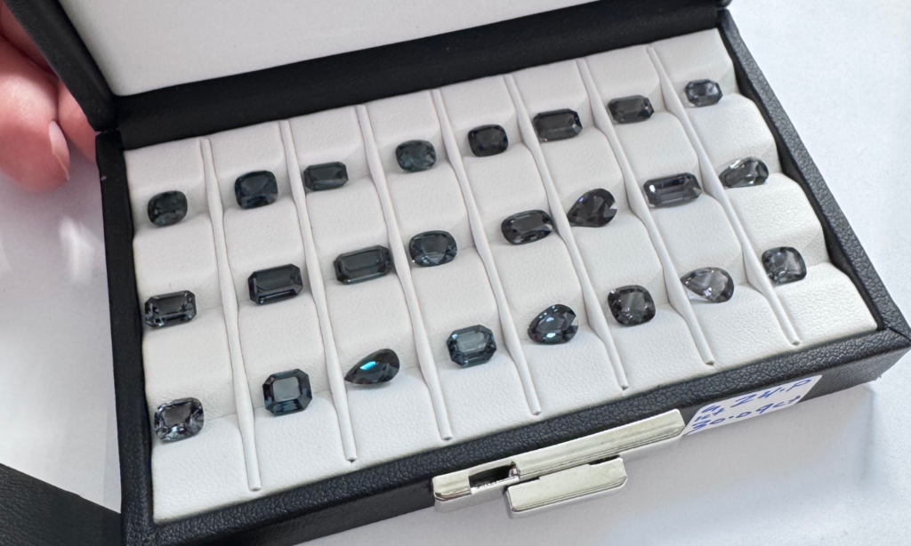
There is a useful visual distinction between bluish grey and greyish blue. In the first, grey remains the dominant impression and blue sits underneath it. In the second, blue is still the main colour but its saturation has been softened by grey.
The boundary is not a universal trade formula, and two people may describe an intermediate stone differently. But asking which impression arrives first—grey or blue—can help explain why two apparently similar spinels feel so different.
Is it grey with a hint of blue, or blue softened by grey? Sometimes that small distinction defines the whole character of the stone.
Why Undertone Can Be Easier to See in Comparison
A subtle undertone can be difficult to identify when a stone is viewed by itself. Place the same spinel beside a neutral grey reference or another grey spinel, and the colour relationship can become much clearer.
This is a normal feature of colour perception. Comparison gives the eye a reference, making a slight blue or violet influence easier to recognise. The stone has not changed; the context simply makes its character easier to read.
Lighting Can Shift the Character You Notice
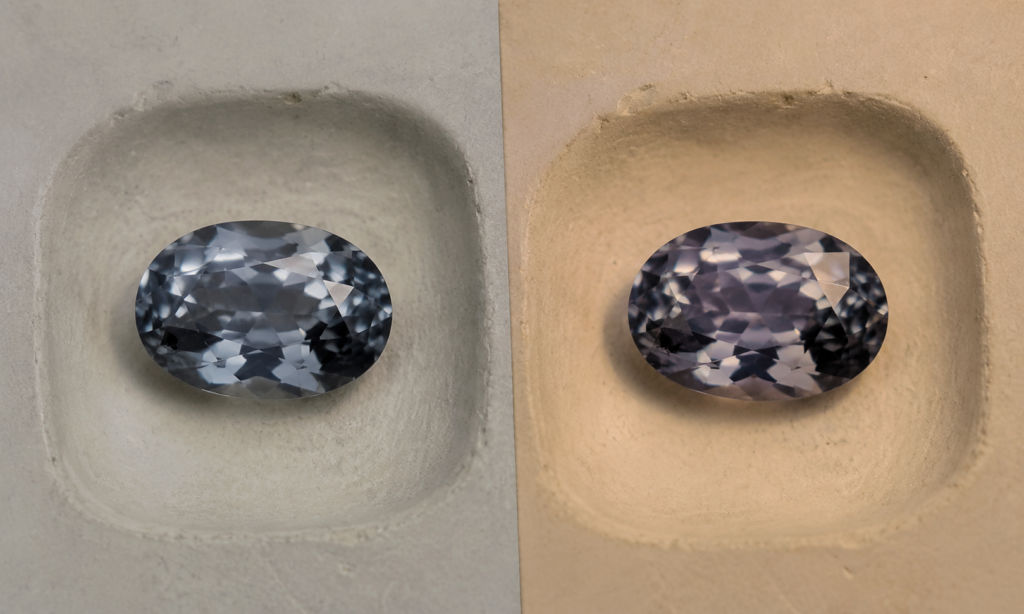
Subtle colours are especially sensitive to the lighting in which they are viewed. A grey spinel may look cooler in one environment and more violet in another because different light sources do not contain the same balance of wavelengths.
GIA research on blue-to-violet spinel has documented stones that appear blue under daylight-equivalent illumination and more violetish under incandescent light. Grey spinel with related blue or violet components can likewise reveal those undertones differently as illumination changes.
This should not automatically be called colour change. A subtle shift in perceived undertone under different everyday lighting is not the same as a clearly defined colour-change phenomenon.
Cut Changes How Grey Is Expressed
Two grey spinels with similar body colour can look very different after cutting. Strong light return can make a pale or medium-grey stone feel crisp and lively. Broader dark reflections can make the same colour direction feel deeper and more architectural.
Step cuts can emphasise long mirror-like reflections, while brilliant-style faceting creates smaller flashes and more movement. Neither effect is automatically better for grey spinel; the cut becomes part of the stone’s visual language.
Grey Spinel in Jewelry
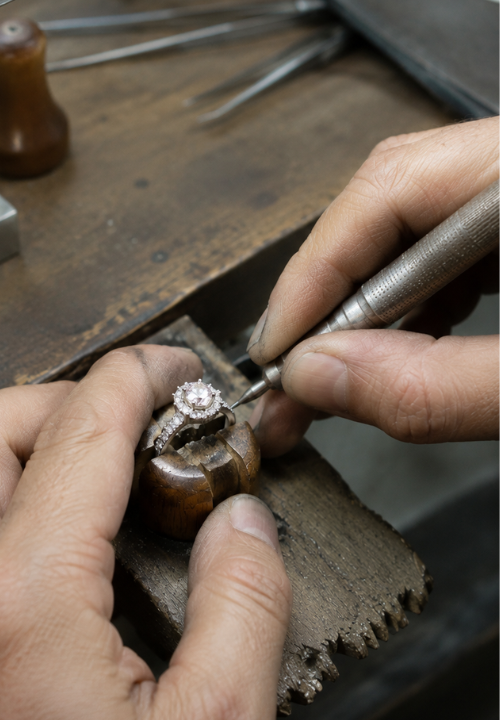
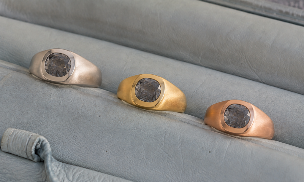
Grey spinel can behave almost like a neutral in jewelry while still retaining the depth and movement of a faceted gemstone. This makes the surrounding metal particularly noticeable.
White gold or platinum can reinforce a cool, monochromatic direction. Yellow gold creates a clear warm-versus-cool contrast. Rose gold can introduce a softer warmth that may interact interestingly with violet or lavender undertones.
These are design possibilities rather than rules. A metal can reinforce the stone’s undertone or deliberately contrast with it, depending on the finished piece you want to create.
How the Market Has Learned to See Grey
Grey spinel is an interesting example of how gemstone preferences can change. In a 2019 report from the Tucson gem shows, GIA observed growing demand for grey spinel and noted that material which might once have been considered too unsaturated had developed a distinct market of its own.
That same report found that most grey spinel carried a slight blue or violet component and that perfectly neutral grey was relatively uncommon. At that particular moment in the market, neutral grey stones commanded special interest, especially at deeper tones.
This is useful market context rather than a rule for personal taste. A collector may seek neutral charcoal grey because it is unusual, while someone designing a softer piece may prefer lavender-grey or a pale bluish grey. Market preference can describe demand; it does not have to become a ranking of what you should like.
Choosing Grey Spinel by Character
Grey spinel becomes easier to understand when you stop asking for one “best grey” and instead look at three related ideas.
- Tone: Do you prefer light and silver-like, medium and balanced, or deep and charcoal?
- Undertone: Does the stone feel neutral, bluish, violet or lavender?
- Character: Do you want the finished piece to feel quiet, crisp, soft, atmospheric or dramatic?
The useful question is not which grey is universally better. It is which combination of tone and undertone creates the character you want to keep looking at—and eventually to wear.
Grey is the starting point. Tone and undertone are what give the stone its character.