
Blue gemstones are often described through intensity: how saturated, vivid or deep the colour can become. Aquamarine offers another way to experience blue. It can be pale and airy, greenish and watery, or deeper and more distinctly blue, while transparency and light remain central to its character.
Aquamarine does not always ask blue to be intense. Sometimes its beauty comes from how much light the blue allows through.
First, What Exactly Is Aquamarine?
Aquamarine is the blue to green-blue variety of beryl, the mineral family that also includes emerald, morganite and other coloured beryls. Its basic chemical formula is Be₃Al₂Si₆O₁₈. Although emerald and aquamarine can look dramatically different, they share the same fundamental beryl structure.
Aquamarine commonly appears in relatively light tones, often with some green influence. That range is part of its natural identity rather than a departure from what aquamarine is supposed to be.
Why Is Aquamarine Blue?
Aquamarine’s blue is connected primarily with iron within the beryl structure. Different oxidation states and iron-related interactions affect which parts of visible light are absorbed, leaving the transmitted and reflected light that our eyes perceive as blue or greenish blue.
The detailed spectroscopy can become complex, but the underlying idea is simple: the beryl structure provides the crystal, while iron helps shape the colour we experience.
Aquamarine Is Not One Blue
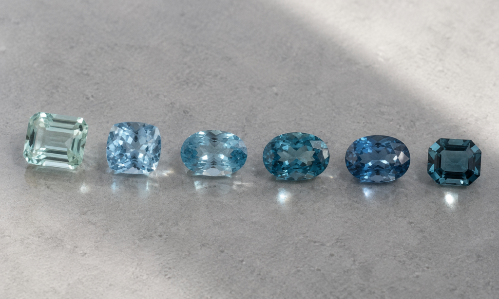
Natural aquamarine occupies a spectrum rather than one fixed blue. It can range through green-blue and greenish blue toward cleaner blue appearances, while tone and saturation can vary considerably from one stone to another.
The market has traditionally placed a premium on stronger blue to slightly greenish-blue material, but market preference is not the same thing as a universal definition of beauty. A green influence can give one aquamarine a distinctly watery character, while a cleaner or deeper blue creates another mood entirely.
Aquamarine is not one blue. Small shifts of green, blue and tone can change the entire mood of the stone.
Transparency Is Part of Its Personality
Aquamarine can form as large, transparent crystals, and faceted material is often relatively clean to the unaided eye. Large eye-clean stones are possible in a way that strongly influences how aquamarine is experienced.
This makes clarity more than a technical specification. When the interior is open, we experience colour together with facet reflections, depth and the passage of light through the stone. Transparency becomes part of aquamarine’s visual language.
Why Aquamarine Can Feel Like Water
Aquamarine’s name has long carried an association with the sea, and its appearance can make that connection feel intuitive. Light blue or green-blue colour, high transparency, vitreous lustre and open areas of reflection can create impressions of clear water, depth and moving light.
This is a visual interpretation rather than a separate gemological phenomenon. The sense of water comes from several properties working together, not from one prescribed shade of blue.
The feeling of water in aquamarine comes not from one colour alone, but from colour seen through transparency and depth.
The Crystal Can Be Remarkably Large
Aquamarine commonly grows in the elongated hexagonal prismatic habit characteristic of beryl, and exceptional crystals can reach remarkable sizes. Historically, very large pieces of aquamarine rough have been recovered, including material weighing many kilograms.
The availability of relatively large, transparent rough has allowed aquamarine to appear not only as conventional faceted gems but also as substantial emerald cuts, elongated shapes, designer cuts, carvings and gem objects.
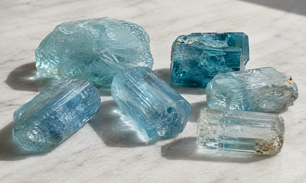
Cut Gives a Quiet Colour Somewhere to Move
Aquamarine is cut into many forms, including emerald cuts, ovals, rounds, cushions and more experimental designer shapes. Its transparency and the availability of elongated rough can make long rectangular and step-cut forms particularly natural choices, but there is no single cut that every aquamarine needs.
Cut changes how colour, depth and reflection meet. Broad facets may emphasize openness and calm flashes of light, while other arrangements create more scintillation. The result is not simply more or less brilliance; it is a different way of experiencing the same blue material.
Aquamarine Can Show More Than One Side of Its Blue
Aquamarine is pleochroic, meaning its colour can appear different when viewed along different crystallographic directions. One direction can show a stronger blue while another may appear much paler or more greenish blue.
This makes crystal orientation relevant when rough is transformed into a faceted gemstone. The cutter is not working with a block of perfectly uniform blue, but with a crystal whose direction can influence the colour ultimately seen face-up.
Heat Can Make the Blue Look Different
Heat treatment is common in aquamarine and is generally used to reduce a green or yellowish component, moving the appearance toward a cleaner blue. The stone remains natural beryl; the treatment changes the balance of colour rather than creating aquamarine from another material.
This does not make heated and unheated aquamarine opposing categories of good and bad. Some people appreciate a cleaner blue, while others enjoy the green-blue character found in untreated material. Understanding treatment simply helps explain why aquamarines in the market can present different versions of blue.
Quiet Does Not Mean Colourless
Calling aquamarine quiet should not imply that pale colour is inherently preferable. Stronger and deeper blue aquamarines also occur and can have considerable presence. The point is that saturation is only one part of aquamarine’s visual identity.
Clarity, light, open space, proportion and subtle colour shifts can contribute just as much to how a stone feels. A pale airy aquamarine, a medium greenish blue stone and a deeper blue example can each create a different experience without needing to compete for the same ideal.
Quiet colour is not the absence of character. Sometimes it allows light, transparency and form to become part of the colour itself.
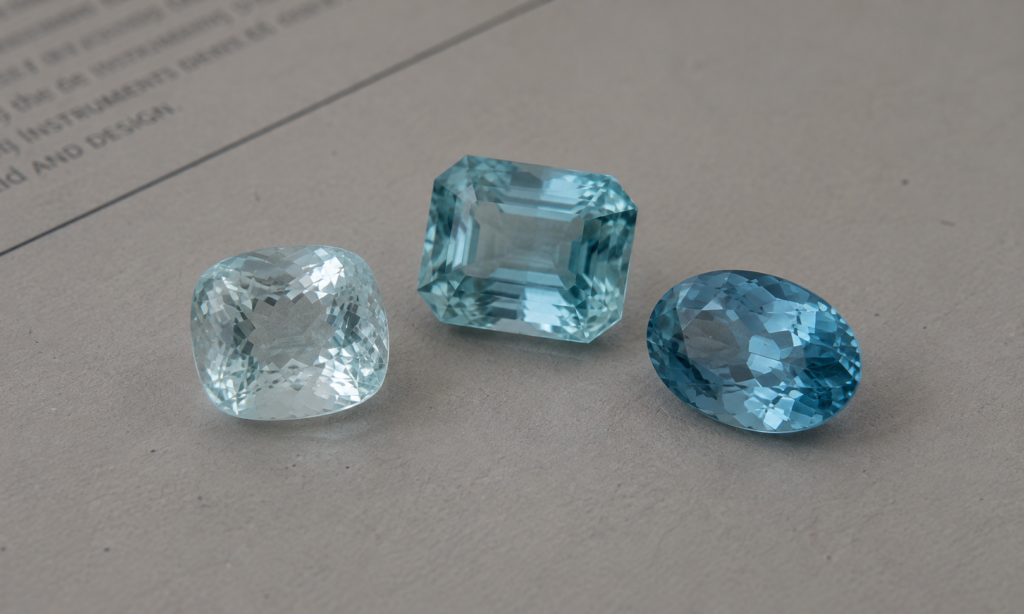
Blue with Room to Breathe
Aquamarine can be pale and open, greenish and watery, or deeper and distinctly blue. What connects these different expressions is not one ideal shade, but a particular relationship between colour and transparency.
Its blue often seems to leave room for light. Facets, depth and open areas within the stone become part of what we notice rather than disappearing behind colour alone. That space is part of what makes aquamarine feel so quietly beautiful.