
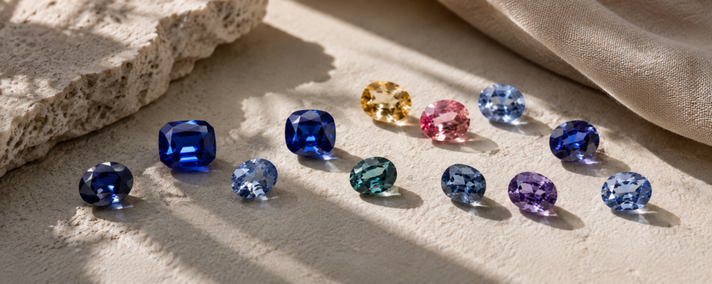
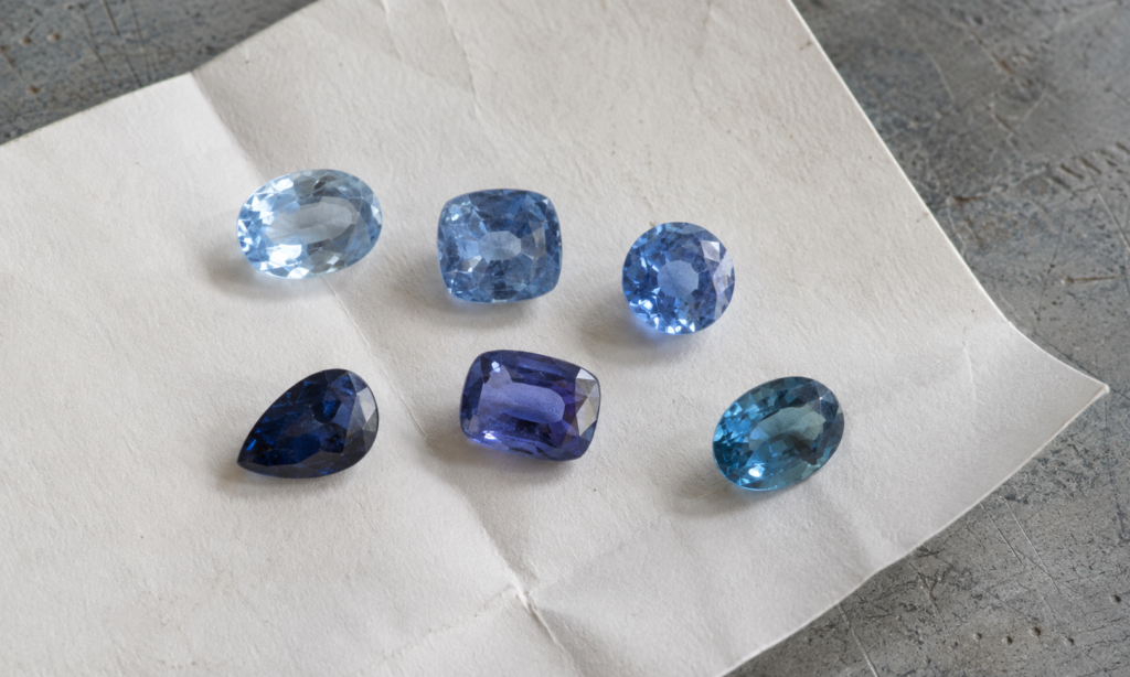
There is no single correct blue for a sapphire. Some stones are light and open, some are balanced and quietly refined, some are intensely saturated, and others carry deeper, violetish or greenish characters.
These differences do not need to be arranged from worst to best. They create different moods, and those moods can change again when the sapphire is placed in a setting, paired with a metal, or worn with the colours and clothes that are already part of your life.
Choosing a blue sapphire can therefore begin with a more personal question: what kind of blue do you want to live with?
Start With the Character of Blue
A colour name alone cannot describe everything you see in a blue sapphire. Tone influences how light or deep the colour appears. Saturation affects how soft or intense it feels. A secondary hue can move the blue slightly toward violet or green, while the cut influences how much brightness returns through the stone.
Instead of searching for one prescribed shade, it can be more useful to notice how these qualities combine and what kind of visual character they create.
Light and Airy Blue
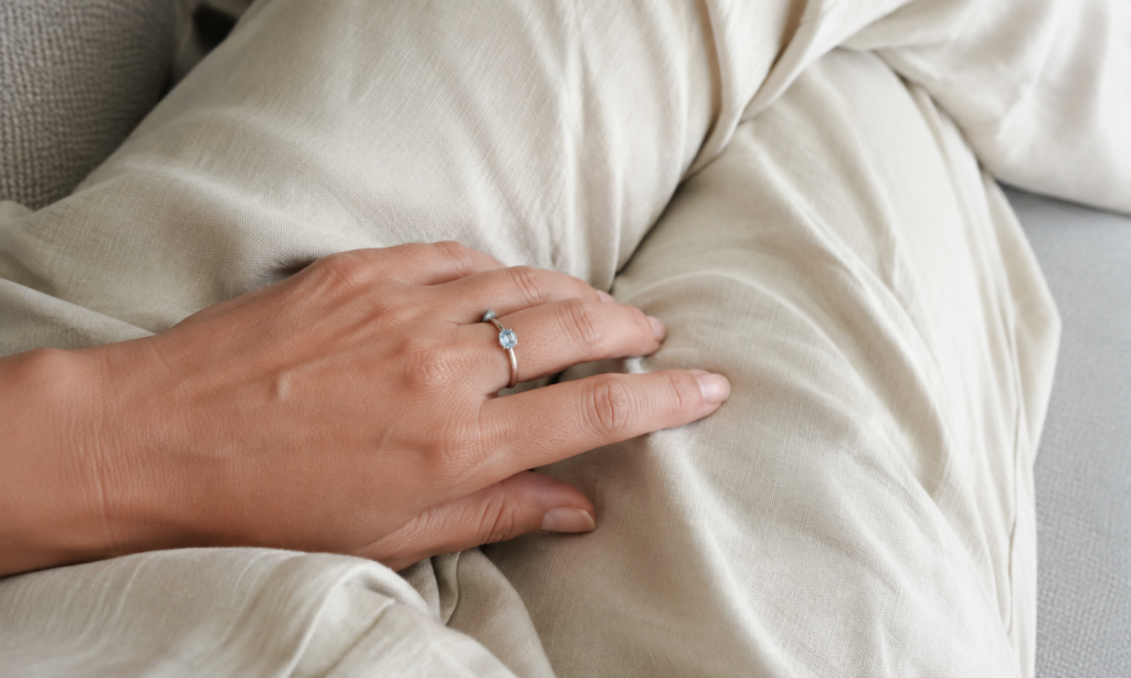
A lighter blue sapphire can feel fresh, quiet and relaxed. Its colour may have less visual weight than a deeper blue, allowing the finished piece to feel understated rather than formal.
This character works naturally with delicate solitaires, fine bands, small pendants and minimal earrings. White metals can reinforce a clean, cool impression, while yellow gold introduces a warmer contrast around the blue.
In a wardrobe, lighter blues sit comfortably beside white, cream, grey, denim, pastels and other light neutrals. They can be especially appealing when the intention is to wear sapphire frequently without making the gemstone feel overly dressed-up.
Balanced Medium Blue
A medium blue can feel composed and recognisably sapphire without becoming visually heavy. Its strength is often versatility: enough colour presence to anchor a piece, while remaining adaptable to different jewelry styles.
It can work in a classic solitaire, a three-stone ring, a halo, earrings or a pendant, and can move easily between traditional and more contemporary settings. Against clothing, medium blue pairs readily with navy, white, black, beige, grey and many earth tones.
For someone imagining one sapphire piece that will move between casual days and more formal occasions, this kind of blue can offer flexibility without needing to be treated as the “safe” or universally correct choice.
Vivid and Saturated Blue
As saturation becomes stronger, blue sapphire can take on a more immediate visual presence. The feeling may become expressive, confident and distinctly jewel-like, particularly when the stone also returns enough light to keep the colour lively.
This character suits jewelry in which the sapphire is intended to be the focal point. A solitaire, a clean halo or a restrained setting can give a strongly coloured centre stone room to speak without requiring the rest of the design to compete with it.
With clothing, saturated blue can behave in several ways. White, black and navy keep the result polished; cream and beige create a warmer neutral setting in which the blue stands forward; stronger colours can turn the same sapphire into a more fashion-oriented contrast.
Deep Blue
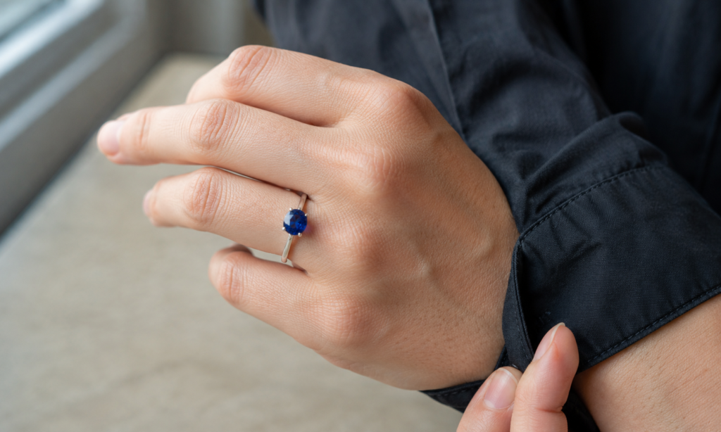
Deep blue has a different kind of presence. It can feel restrained, serious, architectural or formal, with a visual weight that suits jewelry designed around stronger lines and quieter colour.
Depth of tone should not, however, be confused with a sapphire simply appearing black. A deep stone can still retain recognisable blue character and areas of brightness when viewed face-up. How much darkness feels attractive is ultimately part of the aesthetic choice.
Deep blue can work particularly well with signet-inspired forms, heavier bands, geometric settings and designs influenced by Art Deco or architectural geometry. It also sits naturally beside black, charcoal, navy and tailored clothing, while white can create a sharper contrast.
Violetish Blue
When blue carries a noticeable violet modifier while remaining predominantly blue, its character can become softer, more romantic or slightly mysterious. It moves away from the expectation of a conventional pure-looking blue without leaving the blue family altogether.
Violetish blues can work beautifully with white metals, while rose gold can introduce a warmer relationship in selected designs. Delicate, organic or vintage-influenced settings can complement this softer colour direction. In clothing, grey, lavender, dusty pink, white and cool muted neutrals can create a similarly gentle palette.
Greenish and Teal-Leaning Blue
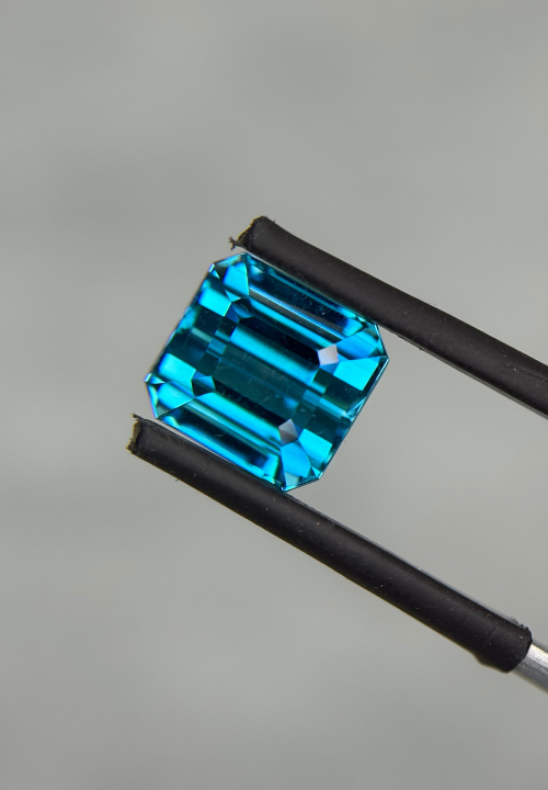
A blue sapphire with a green modifier can feel contemporary, natural and less traditional. Some stones sit only slightly away from blue, while others move visibly toward teal, creating a character that may appeal to someone who likes sapphire but does not identify with a classic blue appearance.
This colour direction pairs naturally with modern bezels, east-west orientations, asymmetric details and other contemporary forms. Yellow gold can create a distinct warm-and-cool contrast, while white metal keeps the palette cooler. Earth tones, olive, cream, brown, denim and black can all provide useful wardrobe contexts.
Different Blues, Different Moods
These descriptions are not rules. They are simply a way to think about how colour character can influence the feeling of a finished piece.
| Blue Character | Overall Feeling | Jewelry Direction | Wardrobe Mood |
|---|---|---|---|
| Light & Airy | Fresh, quiet, relaxed | Delicate, minimal | White, cream, pastel, denim |
| Balanced Medium | Composed, versatile | Classic to modern | Easy across neutrals |
| Vivid & Saturated | Expressive, jewel-like | Stone-focused | Polished neutrals or stronger contrast |
| Deep | Restrained, architectural | Geometric, substantial | Dark tailoring and sharp neutrals |
| Violetish | Soft, romantic | Delicate, organic | Cool and muted tones |
| Greenish / Teal | Contemporary, individual | Modern, unconventional | Earthy neutrals and denim |
The Same Blue Changes With the Metal
The metal surrounding a sapphire does not change the gemstone’s actual colour, but it can change the way that colour feels in context.
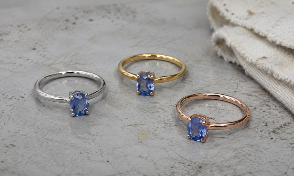
White gold or platinum can make the overall composition feel cooler, cleaner and crisper. Yellow gold places a warm colour beside the blue, creating stronger temperature contrast. Rose gold introduces a softer warmth that can interact particularly interestingly with violetish or gentler blues.
There is no universal pairing that every blue sapphire requires. Metal is part of the design language, and the same stone can take on a noticeably different personality when the surrounding colour changes.
Think About the Jewelry, Not Only the Loose Stone
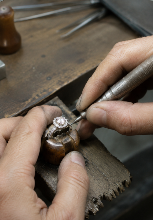
A sapphire is often first viewed loose, but that is not how it will ultimately be experienced. Once set, the stone sits beside metal, perhaps diamonds or other gemstones, and against skin. Its apparent scale and visual presence also change when it moves from a gem tray to a hand, ear or neckline.
A blue that feels powerful as a loose stone may become beautifully balanced in a finished ring. A quieter blue may gain definition from its metal or surrounding stones. A deep sapphire can become the centre of an architectural design, while a light blue can make the same form feel much softer.
It is therefore worth asking not only, “Which blue sapphire do I like?” but also, “What do I want the finished piece to feel like?”
See the Sapphire in More Than One Light
Blue sapphire can look different as illumination changes. Neutral controlled light is useful for comparison, daylight can reveal another side of the colour, and ordinary indoor lighting may be closer to the environment in which the jewelry is actually worn.
The aim is not to find the light that makes a sapphire look “best.” It is to understand its range. If possible, look at the stone in more than one realistic lighting condition and notice whether you continue to enjoy its character as the environment changes.
Choosing the Blue That Feels Like You
If you are drawn to something quiet, a light blue may feel natural. If you want flexibility, a balanced medium blue may fit easily into different settings and wardrobes. Strong saturation can give the gemstone more visual presence; deep blue can feel restrained and architectural; violetish blue can feel softer; and greenish or teal-leaning blue can move in a more contemporary direction.
None of these associations is a grading system. Personal style, skin tone, setting design and the individual gemstone can change the result, and two sapphires that sound similar on paper can still feel completely different when seen in person.
The right blue is not necessarily the one with the strongest name. It is the one whose character still feels right when you imagine wearing it.
Choosing well begins by understanding the sapphire, then imagining the life of the finished piece. The colour should not have to win a ranking to be right for you.